Thursday, 14 March 2013

Evaluation Question 4: How Did You Use Media Technologies in the Construction and Research, Planning and Evaluation Stages?
I am going to split this question into four main topics of discussion. These being 'Research', 'Planning', 'Construction' and 'Evaluation'.
Research
The use of certain websites was incredibly helpful when searching for a new, unsigned, British artist. I researched extensively to find a band who was also local to Norwich, UK due to the fact I thought it would be more of a realistic portrayal of the bands music and personality if they starred in the music video themselves. I used websites such as 'BBC Introducing's website (a part of the BBC who help young local bands to gain attention and even airtime on a hour long radio show once a week at 8pm every Saturday. The link to their website is below.)
http://www.bbc.co.uk/programmes/p010j8y5
Another use of online media, such as websites, to find aspiring bands are concert venue websites listing the coming shows within the near future. In Norwich, Norfolk, UK these are such sites as the UEA (University of East Anglia) ticket booking website. Down the right hand side of this web page are links to other venues around the county.
http://www.ueaticketbookings.co.uk/
To learn more about the band and acquire their logo design etc I discovered they have a website which I visited frequently during the research period of this project. It allowed me to quickly access some of their other songs, a biography of the band, photos, upcoming news and a contact address of either an email address or a social networking site fan-page. The URL is posted below:
http://theupgrade2011.moonfruit.com/
One of the most important websites that has been used throughout this project is 'YouTube'. 'YouTube' allows anyone to immediately access bands music videos and useful resources such as links to the bands official website. I have used several videos from YouTube and embedded them within my blog. This adds another dimension to presenting my work instead of a large amounts of text. This makes it more interesting for the audience reading my blog.
Social networking sites are incredibly helpful in terms of researching my target audience. By using websites such as 'Facebook.com', 'Twitter.com' and 'Tumblr.com' and even the music database 'Spotify' I was able to effectively research my audience across a range of topics such as their favourite bands, what style of clothes they wear, what brands they like, what hobbies they may have etc. After gathering information about which demographic (age, gender, culture etc) my music video would appeal to most I could then start to shape my first drafts of my music video and print productions. The demographic which was the main target audience of my productions are young males aged roughly 16-24 years old of white, British origin. This target audience was chosen after broad research into the genre of rock and metal. I have a previous post on my blog with this research included. Follow this link to read it.
http://jameswa2mediablog.blogspot.co.uk/2012/09/the-origins-of-metal-genre.html
Planning
The process of planning the music video allowed me to consider certain aspects such as location. I went out with a stills camera and took pictures of possible locations to then review at a later date and get possible feedback from my tutor to then develop my ideas further. This was successful and I used one of the locations I had previously researched. Below is a link to a post discussing this location and its potential due to it fitting the genre conventions.
http://jameswa2mediablog.blogspot.co.uk/2012/10/possible-location-shots.html
I researched popular clothing within the genre and allocated rough guide-lines of costume to the band before going out on a shoot so there was no delays. A post of mine on costume is linked below:
http://jameswa2mediablog.blogspot.co.uk/2012/10/actors-costume-within-music-video.html
I research music videos of bands which are a similar genre/style to 'The Upgrade' to see if there were any visual trends amongst the music videos. The way I did this was by watching such channels as 'MTV Rocks' and 'Scuzz Television'. In Question 1 of this evaluation I discuss the conventions of genre relating to location, costume and generic trends which occurred within this genre's music videos.
Constructing
In terms of constructing the music video and print productions (filming/shooting and editing) there were several technological devices used.
The first was a digital camera. This was a 'Cannon HD Digital Handheld Video Camera' and because it was a digital camera recording directly onto an SD card, we were able to review raw footage on the shoot to decide whether or not it was satisfactory and worthy of keeping for later editing.
 |
| SD Card |
Cross-fades. These are not a common feature within music videos of a rock/metal genre however it helps to keep the pace of the video fast and interesting to the audience.


Reverse Shot. Another effect used is reversing shots. This is simply playing a shot backwards which can lead to some interesting effects and visuals. Here we see a young man breathing out a breath of smoke from a cigarette yet played backwards it looks as if he is inhaling it all.


Black and White. The third effect used within the video is switching a colour in black and white/ greyscale. This can be used to show difference between periods of time in terms of a flash back or to make certain shots look menacing. I have used it here to make this graffiti covered, derelict building look more menacing and intimidating.

Sped Up Shots. The blur in this still is due to the pace at which it is moving due to it being a sped up shot. This effect was used to make the video seem to have a fast pace to match the fast shots and quick transitions I have utilised. It creates a hectic tone to the video as well which is a convention I was wanting to achieve because it fits with the genre conventions.

Super Imposing. Finally, the effect below is called 'super-imposition' which involves blending two shots or images on top of one another creating this kind of effect.

The programme I used to produce the digi-pack was Photoshop. Below are some screenshots of the on going project with captions explaining how I arrived at the finished product.
Firstly there is Panel 3 of my CD case. Originally to the right hand side of the band was an image of a blind man painted onto the wall as seen below in the first still.

However in the final version of Panel 3 he is replaced with a soldier holding a metal detector with the phrase "Life is a Mine Field" next to him. To achieve this I had to fade out the image of the blind man and replace him with the soldier. This took a large amount of time to then blend and smudge the edges so it was not apparent that it had been edited and looked professional.

The original image for the magazine advert had a strong yellow tone to it (this was due to the lighting when the picture was taken). To take this 'yellow-ness' out I decreased the yellows in the hue/saturation option.
 |

This is the end product which as you can see has a sepia tone to it yet it is not overpowering the other colours. The poster stands out well yet the colours are all subtle and not sickly due to their brightness/ concentration.

Panel 4 of the digi-pack took a lot of manipulating to create the desired effect. The brick wall on the original image was simply too bright and pink. This did not fit with the genre conventions at all. I wanted to drain the colour out of the picture slightly yet still keep the band members highlighted and in full colour and the main article of the panel.

To achieve this at first I brought the 'reds' down in the mixture of colours however this made the band members look grey and un-exciting. I copied the layer so I had two versions of it. I took the colour down in one yet this kept the band members untouched. This makes the scene they are in dingy and unpleasant. Again this fits with the genre convention thus making it a success in terms of fitting the requirements.

Technology helps to offer new opportunities and the chance for creativity.For example if you take an image and import it into Photoshop there are endless amounts of different combinations of effects, filters and colour tools you can apply to the image. Even if the end result was unplanned it still allows the user to discover the potential to create an appealing image. Even technology on handheld camera's such as the zoom feature (which is now a universal feature and a 'must have' to on every camera) allows directors and even amateur film makers to add a whole other dimension to their product.
New technology helps a producer connect with their audience through such mediums as social networking sites i.e. Facebook, Twitter, Bebo and Tumblr. Relationships between producers and audiences are getting more instant and intimate due to the speed of the internet and a clip could be only for only a couple of minutes yet 50,000 people for example could have viewed it within an instant.
Evaluation
Technology has helped greatly in terms of evaluating my work due to certain things such as being able to insert stills of images whether its a screenshot of a video clip or of a music video (as used in my 'Origins of metal' post). This helps me to be able to compare videos and images with others justifying my choices so everything is clear as to why I have certain things. By being able to embed video's within my blog it makes the blog more user friendly and easier to navigate. This feature has been most helpful when trying to compare music videos of the same genre because instead of having to describe them I can visually display them side by side.
In question 3 of this evaluation I display that one of the methods I used to collect audience feedback is by using the social network site of Facebook. This is extremely helpful because it helps to give another aspect to the research yet also allows a different and slightly younger demographic to review the video. The comments on the video are also free-verse meaning they are not bound by the questions I asked and are free and able to give their own opinion.
Monday, 4 March 2013
Completed Music Video
Posted below is my edited and final cut of my music video for local band, The Upgrade.
Completed Digi-pack
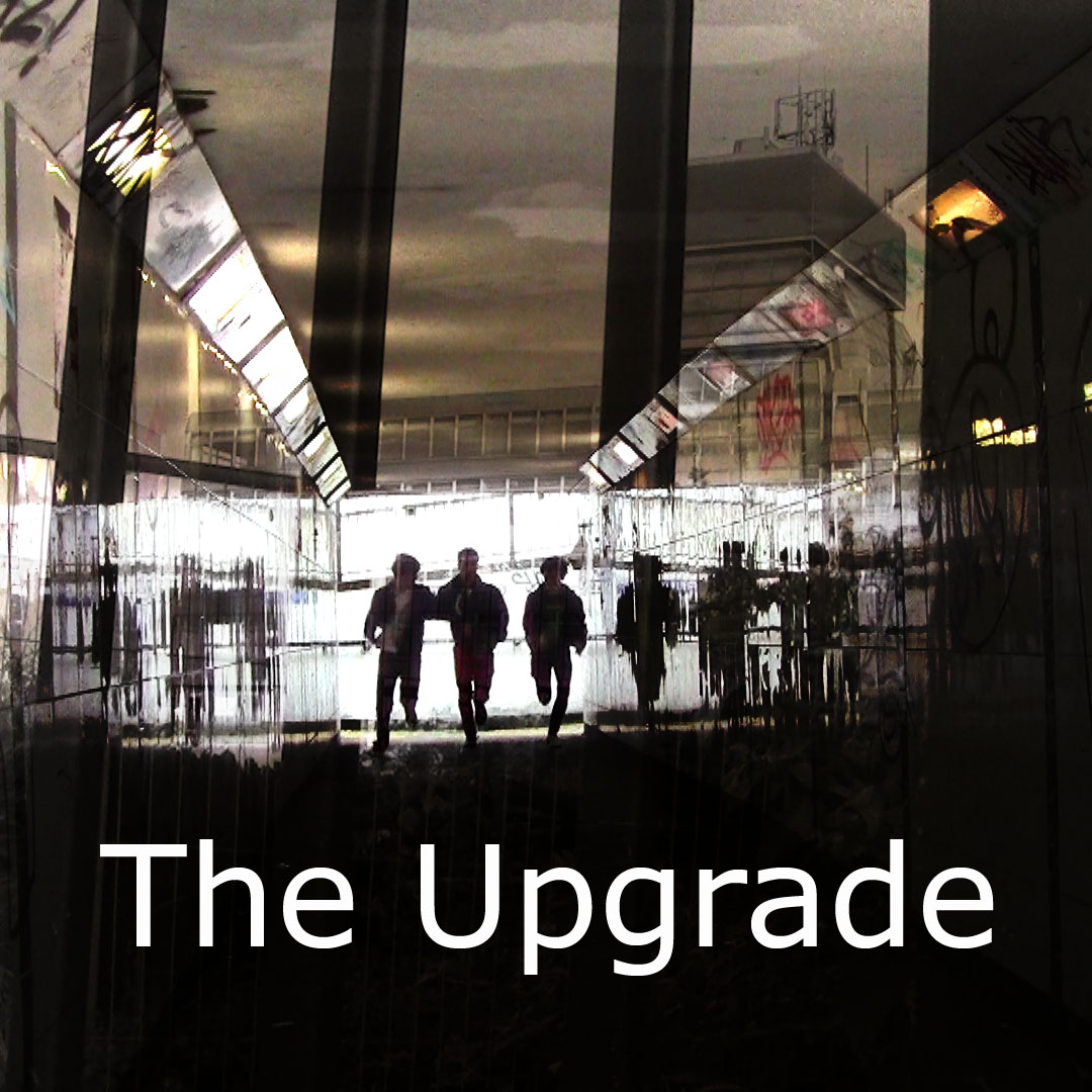
Panel 1

Panel 2

Panel 3

Panel 4
Here is my magazine advert.

Here is my magazine advert.

Monday, 18 February 2013
Draft of Digi-Pack
Below is a draft and initial attempts at making the digipack.
Panel 1

This panel silhouettes the three band members when they're running which helps to give the image pace and a feeling of immediacy. This helps to stand out since they are an up and coming band with a lot of potential. This image is actually a blend of two pictures. One of them running down an underpass and another of a derelict building behind thick, steel bars. Those are the vertical lines seen going down the image. From left to right is the drummer Nick Upton, lead singer and front man Solay Elibol and finally on the right is the bassist Sam Sleight
Panel 2

Again like the first image this Panel is a mixture of two images. The first is a close up of the lead singer/ front man (Solay Elibol) and a low angle shot of an empty car park giving the Panel a vanishing point behind Solay. I edited this image into black and white which creates a dramatic and more serious tone to the album art. This is important since this digi-pack needs to make the band look as if they are fun and fresh yet they are serious about their music and career choice.
Panel 3

In Panel 3, when you take the CD out, will have this image behind it. This features the whole band against a wall with multiple political messages on it such as 'Life Is A Mine Field' to the right of the frame. This makes the bands image seem edgier and contemporary. The music they write, they write with current affairs in mind. The single 'USA' by The Upgrade is a song which has a political message and statement at its core. For example one of the verses within 'USA' is:
"The land of opportunity where every man is rich,
They slaughter all your earnings and they tell you life's a bitch".
"The land of opportunity where every man is rich,
They slaughter all your earnings and they tell you life's a bitch".
The design for the actual CD is posted below. It is The Upgrades logo and its simple, plain and distinctive so when people see it they will immediately think of the band.

Panel 4

The final panel contains several pieces of key information. Starting from the top there is again the upgrades logo which makes the band instantly recognisable to the market and target audience. There is the main image which contains all three band members giving a face to the band name and making it more personal. I have decreased the intensity of the colours on the image like the bricks on the wall which creates a dull and dingy tone to it however kept the artists the same making them stand out slightly. This makes them look important. I have spaced the tracks out evenly with two rows of bricks between them both making the image look more full. At the bottom banner there is the bar code and to the right of this there is the name of the company being 'King of the Camera Productions'. Lastly and perhaps most importantly there is a logo for Facebook. This makes sure that their target audience (being of a younger demographic of roughly 16-25 year olds) can find them on social networking sites to keep up to date with new releases and news on the band.
Below is the magazine advert which I photographed, designed and edited myself. The banner at the top is The Upgrade's logo. This makes them stand out instantly and recognisable to an audience through a symbol. You can also see the faces of all three band members giving a face to the band instead of three enigmatic figures. Solay (the lead singer) is in the middle since he represents the band the most when they play gigs.
At the bottom are reviews by two massively influential music magazines of 'Kerrang!' and 'NME' both rating it highly. In the bottom right-hand corner again there is a link to the bands Facebook page. This allows those who have Facebook to look them up. This gives the band slightly more publicity to the social networking audience. I have increased the level of yellows in the poster giving it a slightly sepia tone. I increased the contrast too which helps to make the white pillars in the background stand out clearer as well as the streetlight in the backdrop.

The final panel contains several pieces of key information. Starting from the top there is again the upgrades logo which makes the band instantly recognisable to the market and target audience. There is the main image which contains all three band members giving a face to the band name and making it more personal. I have decreased the intensity of the colours on the image like the bricks on the wall which creates a dull and dingy tone to it however kept the artists the same making them stand out slightly. This makes them look important. I have spaced the tracks out evenly with two rows of bricks between them both making the image look more full. At the bottom banner there is the bar code and to the right of this there is the name of the company being 'King of the Camera Productions'. Lastly and perhaps most importantly there is a logo for Facebook. This makes sure that their target audience (being of a younger demographic of roughly 16-25 year olds) can find them on social networking sites to keep up to date with new releases and news on the band.
Below is the magazine advert which I photographed, designed and edited myself. The banner at the top is The Upgrade's logo. This makes them stand out instantly and recognisable to an audience through a symbol. You can also see the faces of all three band members giving a face to the band instead of three enigmatic figures. Solay (the lead singer) is in the middle since he represents the band the most when they play gigs.
At the bottom are reviews by two massively influential music magazines of 'Kerrang!' and 'NME' both rating it highly. In the bottom right-hand corner again there is a link to the bands Facebook page. This allows those who have Facebook to look them up. This gives the band slightly more publicity to the social networking audience. I have increased the level of yellows in the poster giving it a slightly sepia tone. I increased the contrast too which helps to make the white pillars in the background stand out clearer as well as the streetlight in the backdrop.

Typeface Possibilities for Digi-Pack
The website 'dafont.com' allows the download of many different typefaces and being able to put in your own personalised text. I have utilised this resource and have selected several examples which are a major inspiration as to the style which i shall use for my own personal digi-pack. These are posted below:
 The reason why this font could work well is because this font stands out and is bold on the page however there is a slight hint of irony in this typeface because the bands name is called 'The Upgrade' and when you upgrade something it becomes newer and more modern however this font looks worn and old. This could suggest the band aren't newcomers and have much experience going into the difficult industry of music.

This font also have the same sense as being worn. I thought this would give the album cover a nice authentic feel. Also this font is recognised as the famous typewriter style of shapes of letter. This relates effectively to the genre because an era when typewriter was popular was during the Second World War when Britain was an incredibly industrial country. The typewriter was invented in 1829 by William Austin Burt however the design was not perfected until 1867 by Christopher Latham Sholes.
 Thirdly, this font stands out boldly off the page which can be an important attribute to have on a CD cover because in a popular CD shop it has to be eye catching so people will pick it up and, if they like the look of it, purchase it. An example of a shop like this is the franchise of 'HMV'.
 This font has the same theory behind it however it is more subtle than the one above due to it being lower case and slightly thinner letters. Out of the 3rd and 4th font posted (comparing simply due to their similarities) I think that the 3rd font would be more appropriate because it has a stronger and more powerful feel about it which is the message that panel 1 of the CD case is trying to put across.
 The font above also has the same worn down look as fonts 1 and 2 however this typeface reminds me of a stone age look. This is due to there being no spaces in the letters and they are just blocks of colour (i.e. there is no gap in the 'loop' of the 'P'). Also the scratches and scars give it an aged and beaten look.
 This font follows the pattern of also being in nearly block letters with hardly any spaces however this font has a clean and contemporary look. My only fear however is that this would not fit into the genre of 'metal' because it looks too clean and plain.
 This lettering is interesting because this is most famously known and recognised for being used in war propaganda but specifically in propaganda for the Russian Revolution in 1917 and it was also part of the First World War. An artist nowadays who has used this style on an album cover is the band 'Franz Ferdinand', (Franz Ferdinand, 18 December 1863 – 28 June 1914, was also the Archduke of Austria-Este). Below is an image of the cover of their album 'You Can Have It So Much Better ' released in 2004 and has sold 3.6 million of this album in particular.

This album cover is actually an inter-textual reference to another image. A man named Rodchenko created this image in 1924. It pictures Lilya Brik shouting the word 'books'. The image Franz Ferdinand has taken and utilised is posted below.

Finally this font has a very work and rough look to it. Again I thought this could bring a certain tone of irony since when you upgrade something it becomes newer however this typeface has an incredibly rough look to it.
 I am still in the process of designing my digi-pack and may not use these fonts depending on how well they fit with Panel 1 of my pack.


This font also have the same sense as being worn. I thought this would give the album cover a nice authentic feel. Also this font is recognised as the famous typewriter style of shapes of letter. This relates effectively to the genre because an era when typewriter was popular was during the Second World War when Britain was an incredibly industrial country. The typewriter was invented in 1829 by William Austin Burt however the design was not perfected until 1867 by Christopher Latham Sholes.


This album cover is actually an inter-textual reference to another image. A man named Rodchenko created this image in 1924. It pictures Lilya Brik shouting the word 'books'. The image Franz Ferdinand has taken and utilised is posted below.

Finally this font has a very work and rough look to it. Again I thought this could bring a certain tone of irony since when you upgrade something it becomes newer however this typeface has an incredibly rough look to it.

Monday, 21 January 2013
Subscribe to:
Posts (Atom)